The menus seen on the Overlay design
What I have tried to do here is create a menu system based on the Portfolio template. Which is a W3C.css template.
This page is an attempt to document what changes that I have made - it is pretty much for my own consumption.
I describe an "overlay" here, strickly speaking the overlay effect is only really relevent on a mobile screen. The desktop resolution fills 300px at the left of the screen, the overlay is container with the id="myOverlay". This is hidden on desktop page loading and then replaced by the container id="mySidebar". The sidebar menu is opened and closed by functions contained in portfolio.js but toggling the style.display attribute between "block" and "none".
The overlay is a specific class from the W3.css framework that is an adaptation of a modal.
The Overlay
The code for the Overlay Menu effect is defined after the "side menu".
<div class="w3-overlay w3-hide-large w3-animate-opacity" onclick="w3_close()" onkeypress="w3_close()" style="cursor:pointer"
title="close side menu" id="myOverlay">
</div>
The "Sidebar/Menu"
This is the first code that is defined on the page. I have modified the original code from the Portfolio template considerably.
On a large screen the side bar is displayed in a container that has the w3-sidebar (plus other W3 classes) a width of 300px and a z-index of 3.
There are two functions defined to open and close the sidebar and overlay containers (these were taken from the original design)
These have the ids: mySidebar and myOverlay.
The functions:
// Script to open and close sidebar
function w3_open() {
document.getElementById("mySidebar").style.display = "block";
document.getElementById("myOverlay").style.display = "block";
}
function w3_close() {
document.getElementById("mySidebar").style.display = "none";
document.getElementById("myOverlay").style.display = "none";
}
</script>
The sidebar code: (abbreviated)
<nav class="w3-sidebar w3-collapse w3-white w3-animate-left" style="z-index:3;width:300px;" id="mySidebar">
<div class="w3-container">
<a href="#" onclick="w3_close()" class="w3-hide-large w3-right w3-center w3-padding w3-hover-grey" title="close menu"
style="text-decoration:none">close menu<br>top
<i class="fa fa-remove"></i>
</a>
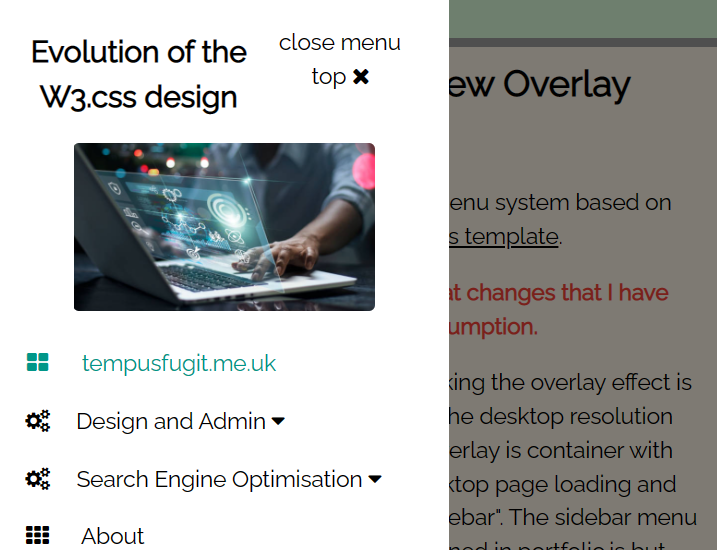
<img src="images/time_flys.jpg" style="width:45%;" class="w3-round" alt="Time Flies" title="Time Flies">
<h4><b>Tempusfugit Web Design</b></h4>
</div>
<div class="w3-bar-block">
<a href="index.html" onclick="w3_close()" class="w3-bar-item w3-button w3-padding w3-text-teal"><i class="fa fa-th-large fa-fw w3-margin-right"></i>
Home</a>
<!-- start of sub-menu1 -->
........
........
The submenu
In this implementation I have 2 sub-menus. This code was developed from my work on dropdowns and accordians.
When I started out I was not sure how many sub-menu to put on the main menu. Too many would be confusing, so I settled on just the two.
The "Friends" template only has a single sub-menu, I have documented the code on that page.
The sub-menu is a development I added to the design based on work completed on the dropdown and accordian analysis. It is simply another w3-bar-item w3-button classed element with a function to control the behaviour of the accordian menu when the element is clicked.
The Expandable Topbar menu
Again, this is an another "complication" that I added to the original "Portfolio" design.
Old style menu button on mobile - I have changed this
When this page is viewed on a mobile phone a banner is displayed (if you are looking at this page on a phone you should be seeing it below the Menu button ). This prompts the visitor to orient their phones 90°.
In addition, when viewed on a computer the Top
button will appear and the Menu button will be displayed on tablet and
phone screens.
When the Menu button is clicked
the overlay menu is displayed. The overlay menu with allow to visitor to go to the top of the screen.