Responsive Two Column layout
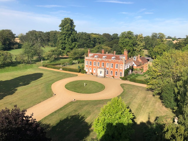
The requirement here is to display an image beside descriptive or other text not above or below as I have on most pages.
The code for this is already used on the Parish Council template.

How this displays on a mobile phone is the key

The effect that I may want to achieve:
This uses the w3-col m6 class - W3.CSS Responsive Fluid Grid
An alternative would be to wrap the text around the image.
This may well work but I have seen some strange displays where the text although wrapped is not readable as it is split over too many short lines.

w3-col Classes
The useage and understanding of this class needs to be explained on this website.