PRE Tag and Mobile Friendly
Menu PRE Tag and Mobile Friendly
 

PRE Tag and Mobile Friendly

The <pre> tag is inherrently unfriendly to mobile displays

The post on Stackoverflow sums this up:

By default, the pre element is meant to preserve text formating. That means that text will not be wrapped inside it, that's why it can expand the whole container.

Try setting the style rule overflow: scroll; or overflow: hidden; whichever you like.

In any case it is probably better to avoid the use of the <pre> tag if you are wanting responsive pages.

My preferred solution to this is to use a "quote box" or my " source-code documenting" coding.

Top

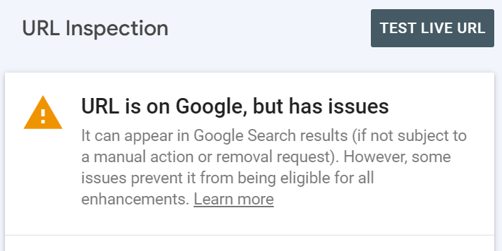
How this is showing up

When I submit pages to Search Console for URL Inspection I get a message telling me that the page is or can be indexed but it has issues.

Links

Top

References: - a note on these

  • pre tag not responsive in mobile - https:// stackoverflow.com/ questions/62982775/ pre-tag-not-responsive-in-mobile
  • Why is my page missing from Google Search? - https:// support.google.com/webmasters/ answer/7474347?hl=en

Site design by Tempusfugit Web Design -